ENG/
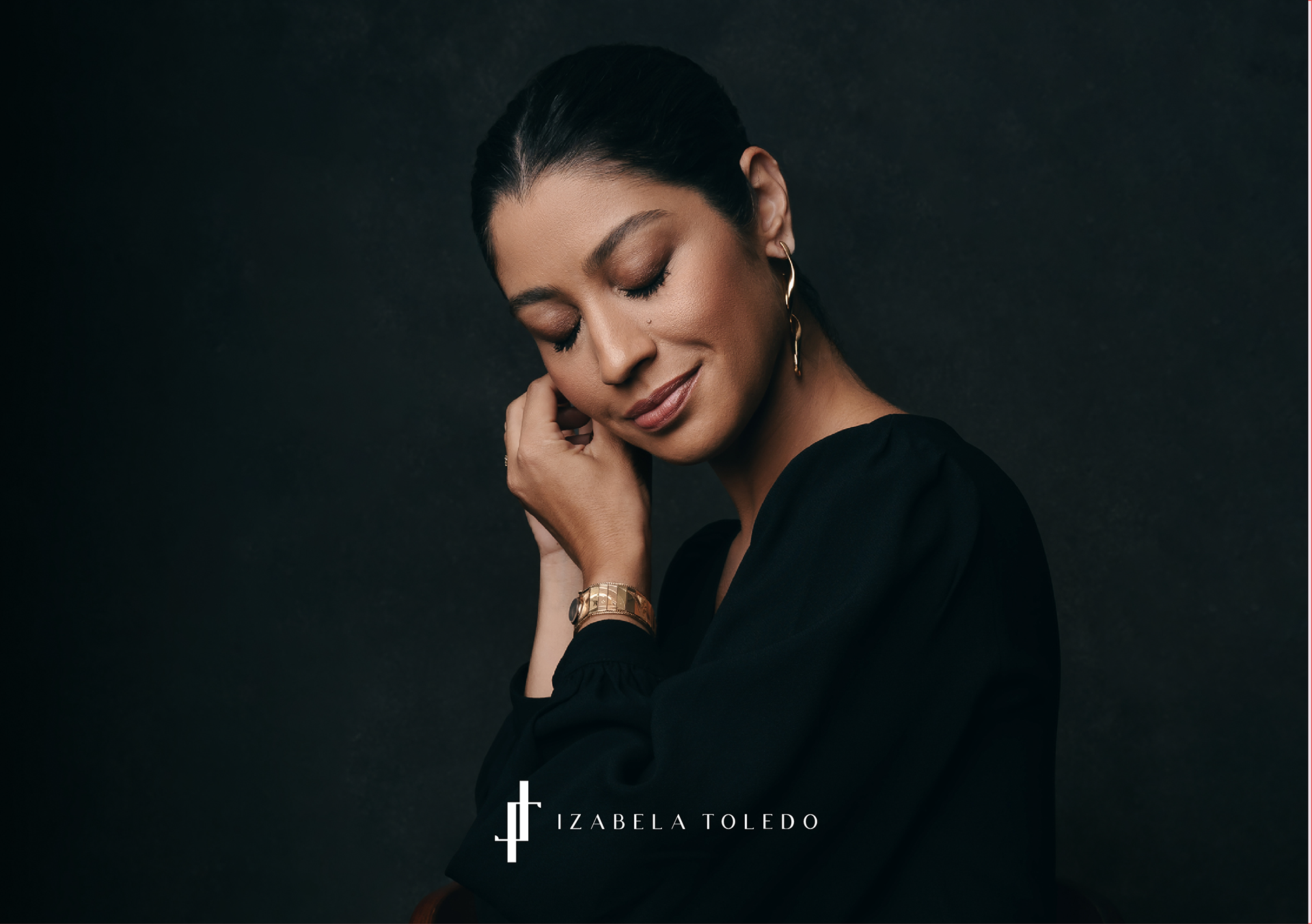
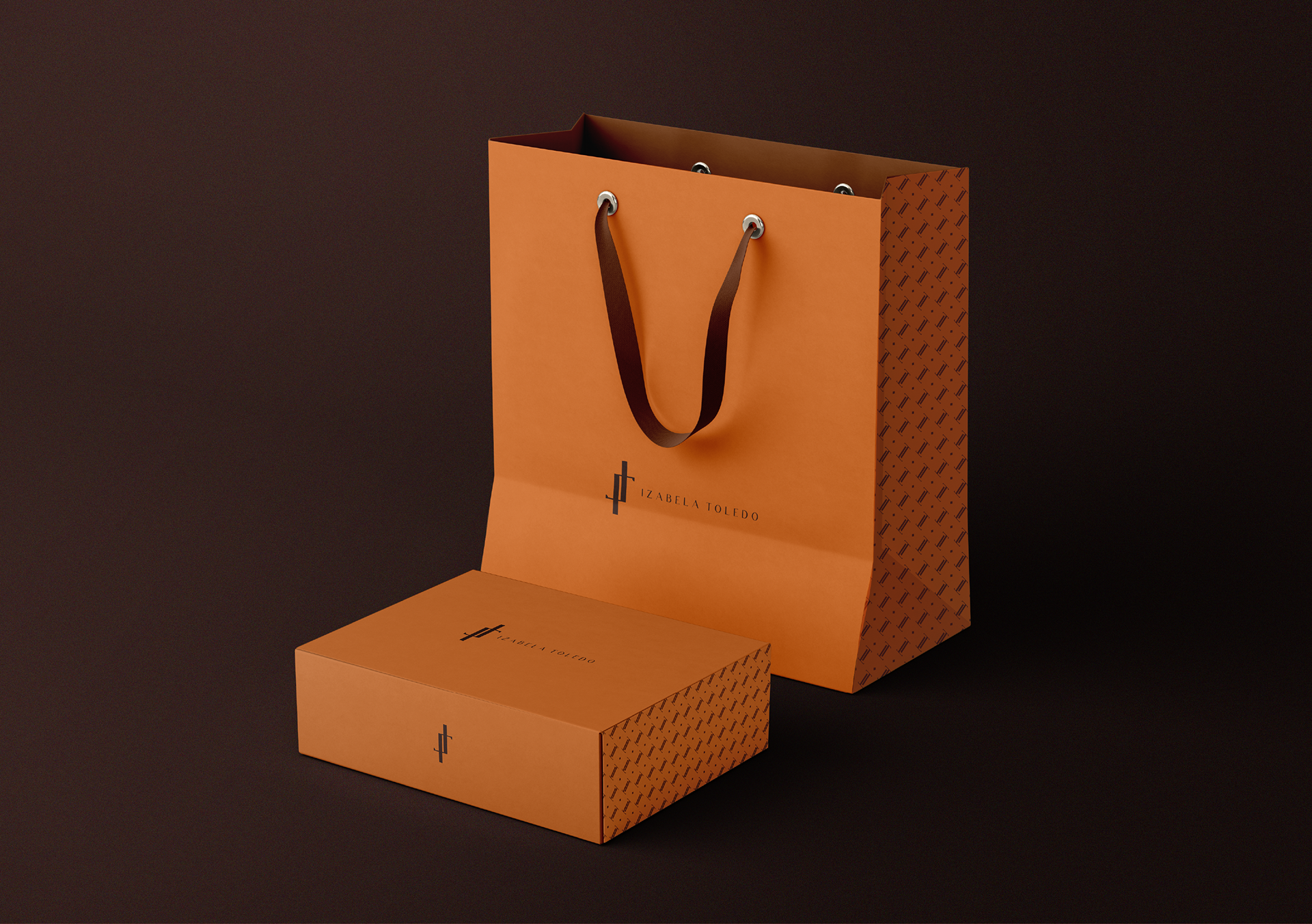
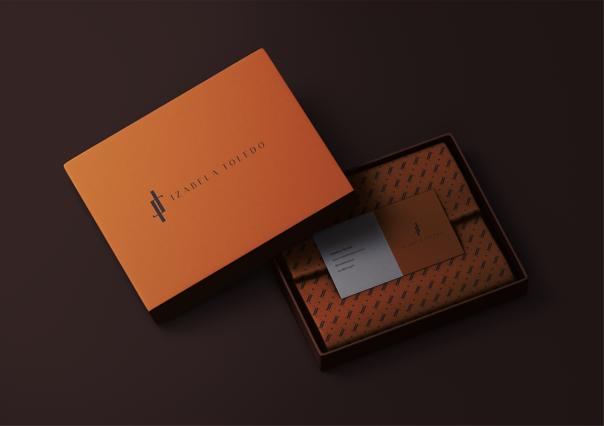
We developed the visual identity for the personal brand of Izabela Toledo, aimed at the luxury segment and positioned as a synonym for exclusivity, elegance, and strength. The challenge was to translate her authentic and sophisticated essence into a logo that conveys presence and refinement.
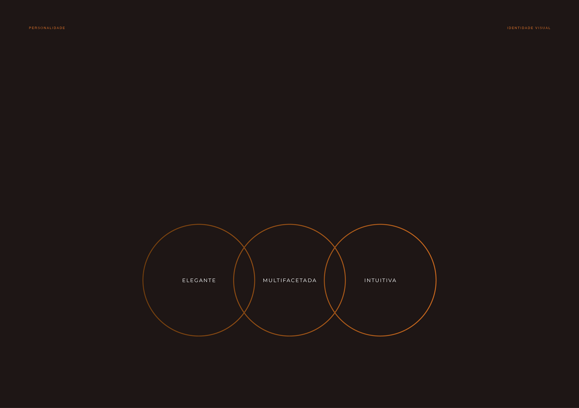
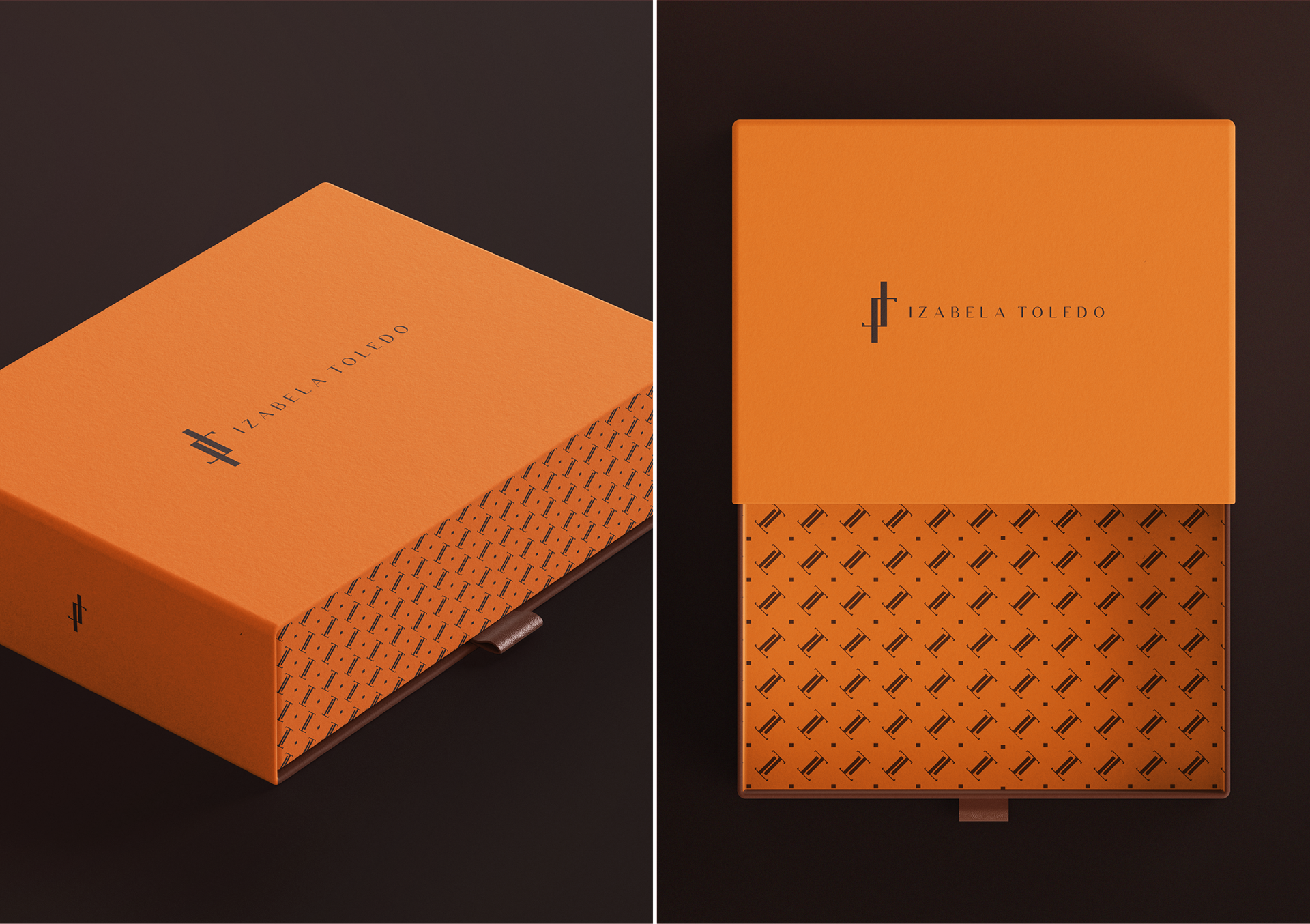
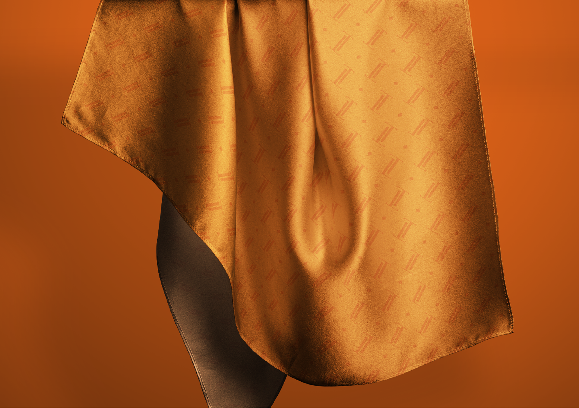
We created a custom typography in uppercase letters, reinforcing the brand's authority and high standards. The symbol, which minimalistically combines the initials "I" and "T", represents the connection between the name and identity in a unique and memorable way. The color palette balances the energy of orange with the timeless elegance of brown, the sophistication of black, and the purity of white — conveying luxury, creativity, and trust.
The result is a strong, consistent, and desirable brand that communicates luxury as an experience of being, living, and feeling.
____
PT-BR/
Desenvolvemos a identidade visual da marca pessoal de Izabela Toledo, voltada ao segmento de luxo e posicionada como sinônimo de exclusividade, elegância e força. O desafio foi traduzir sua essência autêntica e sofisticada em um logotipo que transmitisse presença e refinamento.
Criamos uma tipografia personalizada em letras maiúsculas, que reforça a autoridade e o alto padrão da marca. O símbolo, que une de forma minimalista as iniciais “I” e “T”, representa a conexão entre nome e identidade de forma única e memorável. A paleta de cores equilibra a energia do laranja com a sobriedade do marrom, a sofisticação do preto e a leveza do branco — transmitindo luxo, criatividade e confiança.
O resultado é uma marca forte, coerente e desejável, que comunica o luxo como uma experiência de ser, viver e sentir.